 The European Union needed a logo for its birthday next year and launched a competition among graphic design students ― I linked to the competition using its official logo in Bulgarian, displayed to the right (I just love Cyrillic letters...).
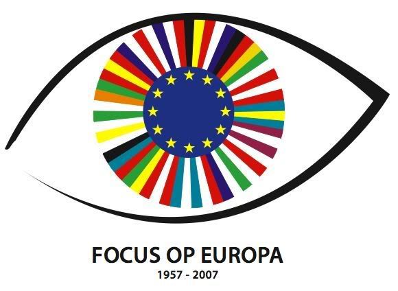
 Now, the panel of 11 independent experts has made its choice, and one may wonder how on Earth (sorry: Europe) they managed to come up with that one. I have discussed it with several people with an interest in, and knowledge of, graphic communication and aesthetics as well as in EUrope, and we all agree that there must be better among 1700 submissions. For example the one here to the left (which, admitted, I am not neutral in estimating but then again, the complete 1700 submissions have not been made readily available to the public).
First of all, you can hardly call the winning logo a logo. Even if I to some extent can understand the idea of using different typefaces creating one word and thus symbolising toget
 herness despite diversity, the use of diacritics is an idea that in my opinion more symbolises lack of understanding. I mean, ö is not pronounced like the o in the English word 'together', é not like the e. Furthermore, it has to be translated into all official EU languages, which only makes this aspect worse. Will the short Dutch word 'samen' become 'šåmęñ' (see? how did you pronounce that, by reflex?) then, since they have to stuff in diacritics? The Dutch-speakers will not even read it, as they will not notice it's a Dutch word.
But have a look at the top 10 submissions and judge for yourself.
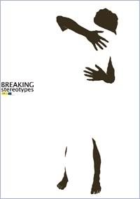
Then they did slightly better in choosing a poster for the 'Breaking stereotypes' campaign. The winning bid is displayed to the right, but there are quite some good contributions here as well!
1 comment:
I füllý ågrèè wïth blõggér Clãseñ.
Post a Comment