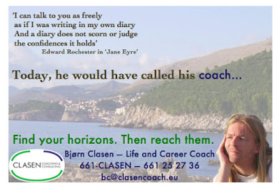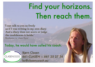
So this is how it will look, the advertisement in the programme for the play ‘Jane Eyre’, which opens in Luxembourg next week.
A huge thank you to each and everyone of you who gave frank, insightful and useful feedback.
The draft ad certainly was subject of debate, both on this blog and on Facebook (not so much on LinkedIn though). It made for a highly interesting and self-reflective process. And I'd like to share some of the conclusions.
The picture
The photo used for the ad turned out to be somewhat controversial. Most agreed that it has a relaxed feel. Whether this is good or bad depends — as everything else — on the viewer. Criticism included ‘it looks like a tourist brochure’. And that I look like a dreamy (one even said ‘sleepy’) New Age hippie. The most creative comment was that I ought to look more assertive.
Other people — and I'll invite those to a party later on :) — really liked that it is ‘so me’. Not in the sense that I am a sleepily dreamy New Age hippie but that the picture expresses genuineness and ‘what you see is what you get’. In other words, it is honest — one of the virtues that characterises a good coach.
The more technical perfectionists also pointed out that the picture of me looks inserted and blurred/in low resolution. Not untrue either, as I faded the background in order for the text to be readable, and enlarged ‘me’.
The text
Most people liked the catchphrase ‘Find your horizons. Then reach them.’ and felt it went well with the photo.
On the other hand, the quote from ‘Jane Eyre’ and especially the sentence following it: ‘Today, he would have called his coach.’ led to confusion. On Facebook I had not explained the context — basic mistake.
As the ad will appear only in the aforementioned theatre programme, those who see it will know what the quote means. If they pay attention to the play, that is :). Otherwise I would not have used that quote, or at least not the concluding sentence ‘Today, he would have called his coach.’
The very useful technical suggestions included: ‘clarify that you're a life coach’, ‘make the word 'coach' more visible’, ‘link the quote to the 'Today…' sentence by using the same font’, and ‘eliminate the full stops, 'cause that's German’…
There were also a few who did not think the text was sufficiently visible and suggested I change colours. Others loved the colour scheme.
Changes
So what did I choose to change? Well, first of all, I chose to keep the photo. It is true that the confusion argued by some was mainly due to the ‘Jane Eyre’ quote and the horizon thing coming from two different idea worlds, as a professionel Graphic Artist and former colleague pointed out.
As 1) my hair colour is different these days because of the play, 2) I am not photogenic on portraits especially (yes, I did try), and 3) I did not have instant access to a good camera, it turned out not to be an option to change the portrait within this short deadline.
Then I could have left out the photo altogether, skipped the horizon part (including catchphrase) and used just the ‘Jane Eyre’ reference. But a photo does catch people's attention much more than words, plus this particular photo provides a surprising contrast inside a theatre programme. So people will notice. Criterion number one — check.
Conclusion: I used the same photo but with me in the original size, meaning smaller than in the draft (thank you, Frederik!).
Textwise, I added ‘Life and Career Coach’ (thank you, Pierre-Yves) and also chose to centre my contact details. After a lot of moving around, deleting, re-inserting, re-moving around and changing and re-changing colours between my logo's green and blue and the nature-brown from the photo, I finally ended up keeping both the catchphrase, the quote (never thought of removing it for this particular ad) and the ‘Today…’ sentence. But —
— I emphasised the quote, making it more of the eyecatcher. In order to clarify and link it to ‘Today, he would have called his coach’, I also added the first name of the character who says the quote, and I changed ‘Today…’ to the same font. Except for the word ‘coach’, which I (thanks, Maruška) emphasised by leaving it in the same font as the (now former) catchphrase and my contact details.
This and the added ellipsis (‘…’) should link it directly to ‘Find your horizons. Then reach them.’, which I instead moved down right before my contact details as a kind of slogan (and therefore had to keep the full stops as it is now on one line). I could have left out this phrase but then — again — I should leave out the photo too, and most people did like the slogan. Which is why I will probably use it in future ads, maybe as a real catchphrase like in the draft, and might therefore as well use it in my first ad. So people will recognise. Criterion number two — check.
Like it or not. Bad ads are better than indifferent ones. And this one certainly did not leave anyone indifferent. Criterion number three — check.
So it won't be the last time I encourage you to contribute with your criticisms, your ideas …and your praise. I appreciated it, all of it. Thanks again! Spread the word!! And do come see ‘Jane Eyre’, so you will know when Edward Rochester says those famous words.
Bjørn Clasen
Clasen Coaching & Consulting
